
Most shelter KPI dashboards look impressive but don't actually drive decisions. You've got intake numbers, adoption rates, length of stay, maybe some medical stats thrown in. The board loves the charts. Staff glances at them during meetings. Meanwhile, your actual operational decisions happen based on walking through the kennels at 7am or getting a frantic text about running out of space.
The disconnect between what we measure and what triggers action keeps killing shelter operations. I've watched shelters track 40+ metrics while missing the three signals that should've triggered emergency foster recruitment two weeks earlier. The problem isn't having data—it's knowing which specific thresholds mean you need to act RIGHT NOW versus next week versus next month.
Why traditional shelter metrics fail at capacity management
Standard shelter dashboards track outcomes after they've already happened. Your average length of stay might be 18 days, but that doesn't tell you that dogs arriving this week will actually stay 35 days because you're heading into summer when adoptions slow down. By the time your dashboard shows capacity problems, you're already turning away animals or cramming them into offices.
The operational reality is that shelter capacity isn't just about physical kennels. It's the intersection of available foster homes (active, not just approved), staff coverage for basic care, medical isolation needs eating up adoptable space, behavioral holds blocking flow, and seasonal adoption patterns nobody tracks properly.
A shelter with 100 kennels might hit operational capacity at 75 animals if half the staff is out with flu, or might handle 110 if fosters are engaged and adoptions are moving. Static capacity metrics miss this completely.
Most shelters discover they need emergency fosters when they're physically out of space. But the signals were there weeks earlier—a slight uptick in owner surrenders, adoption applications dropping 20%, or that rescue partner who usually takes 5 dogs monthly going quiet. These early indicators should trigger foster recruitment campaigns, not the sight of dogs in crates in hallways.
The five KPIs that actually predict operational crunch points
After analyzing capacity crises across dozens of shelters, the pattern becomes clear. These five metrics, when tracked with specific thresholds, predict problems 10-14 days before they become emergencies:
Streamline your shelter operations effortlessly.
Animlly helps you manage every pet, volunteer, and adoption step with ease and accuracy.
- Comprehensive pet profiles
- Volunteer scheduling & communication
- Adoption tracking & reporting
No credit card required
1. Intake Velocity Change Rate Not just how many animals came in, but how fast the rate is changing week-over-week. A 15% increase sustained for two weeks means you'll hit capacity issues in 10-12 days, even if current occupancy looks fine.
2. Adoption Application Quality Score Track not just application numbers, but completed applications that pass initial screening. When quality apps drop below 1.5x your weekly adoption target, you've got 2-3 weeks before length of stay starts climbing.
3. Foster Available Capacity The percentage of approved fosters who haven't had an animal in 30 days. When this drops below 40%, you lose surge capacity for emergencies. Most shelters don't even track this—they count total approved fosters and wonder why nobody responds to urgent pleas.
4. Medical Pathway Clearance Rate Animals clearing medical hold daily versus new medical cases. When your clearance rate drops below 80% of intake for three consecutive days, medical isolation will overflow into adoptable space within a week.
5. Network Transfer Acceptance Rate The percentage of transfer requests to partners that get accepted. When this drops below 60%, your overflow valve is closing. Start foster recruitment immediately, not when rejections hit 90%.
Building decision thresholds that trigger specific actions
Raw metrics mean nothing without action thresholds. Here's what an operational shelter KPI dashboard actually needs:
Green Zone (Normal Operations):
-
Intake velocity
±10% of seasonal average
-
Quality adoption apps
2x weekly adoption target
-
Foster available capacity
>50%
-
Medical clearance
>90% of intake
-
Transfer acceptance
>75%
Actions: Standard operations, routine foster engagement
Yellow Zone (Pre-emptive Actions):
-
Intake velocity
15-25% above seasonal average
-
Quality adoption apps
1.5-2x weekly target
-
Foster available capacity
35-50%
-
Medical clearance
80-90% of intake
-
Transfer acceptance
60-75%
Triggered Actions:
-
Launch foster recruitment campaign (not crisis messaging)
-
Schedule additional adoption events for next weekend
-
Contact rescue partners proactively
-
Prep overflow space
-
Cross-train staff for flexible coverage
Red Zone (Immediate Interventions):
-
Intake velocity
>25% above seasonal average
-
Quality adoption apps
<1.5x weekly target
-
Foster available capacity
<35%
-
Medical clearance
<80% of intake
-
Transfer acceptance
<60%
Triggered Actions:
-
Emergency foster campaign with specific ask
-
Adoption special launching within 24 hours
-
Activate volunteer surge team
-
Implement intake diversion protocols
-
Daily capacity meetings at 8am
The difference between yellow and red zones determines whether you're being proactive or reactive. Yellow zone actions prevent red zones.
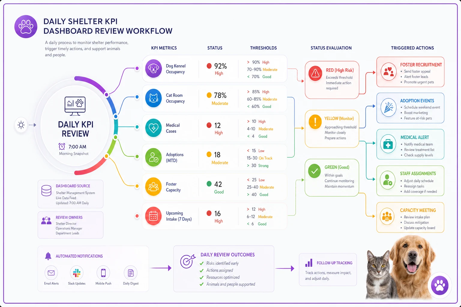
Mock dashboard design for daily decision-making
Forget beautiful charts that require interpretation. Your operational dashboard needs traffic lights and specific action triggers.
Morning Snapshot (checked at 7am daily):
| Metric | Current | Threshold | Status | Required Action |
|---|---|---|---|---|
| Open Kennels | 8 | <10 | 🟡 | Prep foster campaign |
| Intake Yesterday | 12 | >10 | 🟡 | Check weekly trend |
| Adoption Apps Pending | 15 | <20 | 🔴 | Schedule adoption counselor overtime |
| Medical Holds | 22 | >20 | 🟡 | Alert medical team |
| Foster Check-ins Due | 5 | >3 | 🟡 | Assign to volunteers |
Weekly Trend Dashboard (reviewed Mondays): A simple line graph showing four weeks of history for each key metric, with threshold lines clearly marked. Not 20 different charts—one unified view where patterns jump out.
Capacity Forecast (updated Wednesdays): Based on current metrics, show predicted capacity status for next 7, 14, and 21 days. This drives proactive decisions rather than reactive scrambling.
The dashboard shouldn't just show data—it should scream "DO THIS NOW" when thresholds are crossed.
A quick visual of the daily decision workflow helps teams follow the steps.
The dashboard shouldn't just show data—it should scream "DO THIS NOW" when thresholds are crossed.
Foster activation triggers beyond crisis mode
Most shelters only activate foster networks during visible crisis. The dogs are literally in the hallways, the emergency email goes out, maybe 30% of fosters respond, and you squeeze through another week. This reactive cycle burns out fosters and staff.
The shelter KPI dashboard should trigger foster engagement at three levels:
Maintenance Mode (Green Zone):
-
Weekly foster newsletter with upcoming needs, success stories, and gentle reminders that being available helps. No urgency, just connection. Track open rate and click-through as leading indicators of foster engagement.
Preparation Mode (Yellow Zone):
Personal texts or calls to fosters who haven't had animals in 30+ days. Not asking them to take someone today—asking about their availability next week. Frame it as planning ahead, not emergency response. When fosters know they're specifically needed next Tuesday, response rates jump from 30% to 65%.
Activation Mode (Red Zone):
Specific, urgent asks with exact timeline. "We need 8 foster homes by Thursday for medium dogs, can commit to 2-week minimum." Include what support you're providing—food, medical, behavioral backup. Make saying yes as easy as possible.
The dashboard should automatically flag which fosters to contact based on time since last foster, type of animals they take, availability patterns (some fosters only available summers), and success history with challenging cases.
This isn't a mass email blast—it's targeted activation based on actual capacity needs and foster capabilities.
Medical and behavioral bottlenecks hiding in standard metrics
Length of stay averages hide the real capacity killers. A shelter might show 21-day average length of stay while having 15 dogs sitting in behavioral hold for 60+ days. Those long-stay animals don't just take up space—they cascade into every other operational metric.
Track these separately:
-
Medical hold conversion rate (what percentage eventually become adoptable)
-
Behavioral assessment backlog (dogs waiting for evaluation)
-
Long-stay threshold violations (animals exceeding 2x average length of stay)
When behavioral assessment backlog exceeds 5 animals or 3 days of assessments, that's a yellow flag. It means adoptable animals will start backing up within a week. The dashboard should trigger specific actions: schedule additional assessor hours, implement fast-track protocols for obviously adoptable animals, or activate foster-to-adopt programs for dogs awaiting assessment.
Medical holds that aren't clearing signal different problems. If conversion rate to adoptable drops below 70%, you're using prime space for animals that may need weeks of treatment. The dashboard should trigger expansion of medical foster program, earlier euthanasia discussions for poor prognosis cases, or partnership with veterinary schools for complex cases.
Seasonal patterns most shelters track wrong
Everyone knows about kitten season. Fewer shelters properly track the post-holiday surrender spike, the summer adoption slump, or the weird dip in October when everyone's focused on Halloween.
Your shelter KPI dashboard needs seasonal adjustment built in, not just raw numbers. A 20% intake increase in June might be normal. The same increase in February signals something breaking in your community.
Build baseline patterns from 3 years of data:
-
Average weekly intake by month
-
Adoption conversion rates by season
-
Foster availability by time of year
-
Medical case complexity patterns
When current metrics deviate more than 15% from seasonal baselines, that's when thresholds should trigger. Otherwise, you're constantly in crisis mode during predictable busy seasons.
The dashboard should start showing warnings 3-4 weeks BEFORE historical spike periods. If May typically brings 40% more intake, April 15th should trigger foster recruitment, not May 15th when you're already swamped.
Response protocols when triggers activate
A dashboard without response protocols is just expensive decoration. Each threshold violation needs a specific, documented response that any manager can execute.
Example Protocol: Intake Velocity Yellow Flag
When triggered: Intake up 15-20% over seasonal baseline for 5+ consecutive days
Immediate actions (within 4 hours):
-
Send capacity alert to foster coordinator
-
Schedule adoption event for coming weekend
-
Contact top 3 rescue partners about upcoming transfers
Day 1 actions:
-
Launch "Foster Hero" campaign on social media
-
Extend adoption hours for rest of week
-
Review and reduce adoption fees if appropriate
Day 2-3 actions:
-
Personal outreach to inactive fosters
-
Implement fast-track adoption for senior animals
-
Activate volunteer adoption counselors
If still yellow after 3 days:
-
Escalate to leadership team
-
Consider intake diversion protocols
-
Prepare crisis communication templates
The protocol removes decision paralysis. When the dashboard shows yellow, everyone knows exactly what happens next.
Technology setup without complex systems
You don't need a $50k business intelligence platform. Most of this runs fine in Google Sheets with some basic formulas, though purpose-built shelter management software makes it far easier to maintain.
The minimum viable dashboard needs:
-
Daily data entry (can be 5 minutes each morning)
-
Automatic threshold checking (basic IF/THEN formulas)
-
Visual indicators (conditional formatting for colors)
-
Weekly trend calculation (simple moving averages)
-
Automated email alerts when thresholds are crossed
The fancy version adds real-time intake tracking from your shelter software, automated foster availability surveys, integration with adoption platforms, predictive modeling based on historical patterns, and mobile alerts for managers.
Start with a Google Sheet and keep the daily update under 5 minutes to build the habit.
Start simple. A Google Sheet that takes 5 minutes to update beats a complex system nobody uses. The discipline of checking these five metrics daily and responding to thresholds matters more than the technology.
What transforms shelter operations isn't having more data—it's knowing exactly which numbers trigger which actions.
Building team buy-in for threshold-based decisions
The best shelter KPI dashboard fails if staff ignores the triggers. I've seen shelters invest in beautiful dashboards that managers override because "this week feels different" or "we've handled worse." The thresholds become suggestions, the yellow zones get ignored, and you're back to crisis management.
Getting buy-in requires three things:
First, involve the team in setting thresholds. Your intake coordinator knows better than anyone what number starts feeling overwhelming. Your foster coordinator can tell you exactly when available homes dry up. When they help set the triggers, they trust them.
Second, track threshold effectiveness. Document every time you respond to a yellow flag and what happens. After three months, you'll have proof: "The five times we responded to yellow intake flags, we avoided red zones. The two times we ignored them, we hit crisis within a week." Data beats arguments.
Third, make threshold responses less painful than crisis management. If responding to a yellow flag means working one extra Saturday but avoiding a red zone means working three weekends straight, the choice becomes obvious. Staff starts watching for yellow flags because preventing fires beats fighting them.
The dashboard becomes trusted when it proves itself. Those first few successful yellow-zone interventions build credibility that no amount of training can create.
When dashboards need adjustment
No threshold stays perfect forever. Community dynamics shift, your foster program grows, medical capabilities expand. The triggers that worked last year might fire too often or too late now.
Review thresholds quarterly, but only adjust based on patterns, not single events. If yellow flags triggered 8 times last quarter but only 2 progressed toward red, maybe yellow needs tightening. If you hit red zones without yellow warnings, thresholds need loosening.
Track false positives and false negatives:
-
False positive
Yellow flag triggered but no capacity issue developed
-
False negative
Hit capacity crisis without dashboard warning
Aim for 70-80% accuracy. Perfect prediction is impossible, but catching most problems early transforms operations. One surprise crisis quarterly beats three monthly fire drills.
The shelter KPI dashboard should evolve with your operations. As foster programs strengthen, capacity thresholds can tighten. As medical capabilities grow, clearance rate expectations increase.
Your operational reality is that capacity management isn't really about space—it's about flow. Animals need to move through your system at a pace that matches intake. When that flow slows anywhere—medical holds, behavioral assessment, adoption counseling, foster placement—capacity problems cascade through everything else.
The right metrics with clear thresholds catch those slowdowns before they become visible crises. You shift from asking "How do we handle this emergency?" to "What early intervention prevents the emergency?" That shift from reactive to proactive management changes everything about how a shelter operates.
The dashboard isn't the goal. Operational stability is the goal. The dashboard just tells you when and how to act to maintain that stability. Every threshold, every trigger, every protocol serves that purpose: keeping animals flowing through your shelter at a sustainable pace.
Most shelters will keep managing by walking the kennels and hoping for the best. The ones that build disciplined KPI tracking with clear action triggers will handle 20% more animals with 50% less crisis-mode scrambling. The data exists. The patterns are predictable. The question is whether you'll build the system to act on them before the crisis hits.
Ready to enhance your shelter’s impact?
Join 500+ shelters using Animlly to improve care coordination, increase adoptions, and engage communities effectively.