

Most shelters can tell you how many animals they took in last month and how many walked out the front door with a new family. What they usually can't tell you is whether the animals were better off, whether those adoptions actually held, or whether the shelter made a dent in the pressures driving surrenders in the first place. Those three questions live in three different worlds, and almost nobody measures them as one connected system.
That gap is what this piece is about. A proper shelter outcome measurement framework treats welfare, rehoming quality, and community resilience as three tiers that feed each other — not as separate reports you pull for different audiences. When they're disconnected, you end up optimizing one at the expense of the others without even realizing it. Push live-release rate too hard and you quietly inflate returns. Chase adoption speed and you erode the behavior work that keeps animals home. Measure everything in isolation and your board sees a dashboard full of green while your foster network burns out.
Why single-metric shelters plateau
The most common measurement setup in small and mid-size shelters is a spreadsheet with intake, outcomes, and length of stay (LOS), plus a live-release percentage that gets reported to the board and maybe a funder. It's not wrong. It's just shallow, and it hides tradeoffs.
A pattern that keeps showing up: a shelter gets its live-release rate up to the low 90s, celebrates, and then notices that returns are climbing and staff morale is dropping. Nobody connected those things because they lived on different tabs. The live-release number was doing its job — as a vanity metric. It said nothing about whether the animal was healthy on exit, whether the match was sound, or whether the adopter had support after they left the parking lot.
The deeper issue is that a single headline metric can't hold a tradeoff. Real operational decisions almost always involve tradeoffs — spend more on medical and your cost-per-outcome rises but welfare improves; slow down adoptions to do better matching and your LOS goes up but returns drop. A framework that can't show those tradeoffs forces leadership to make budget and governance decisions blind.
The three-tier structure
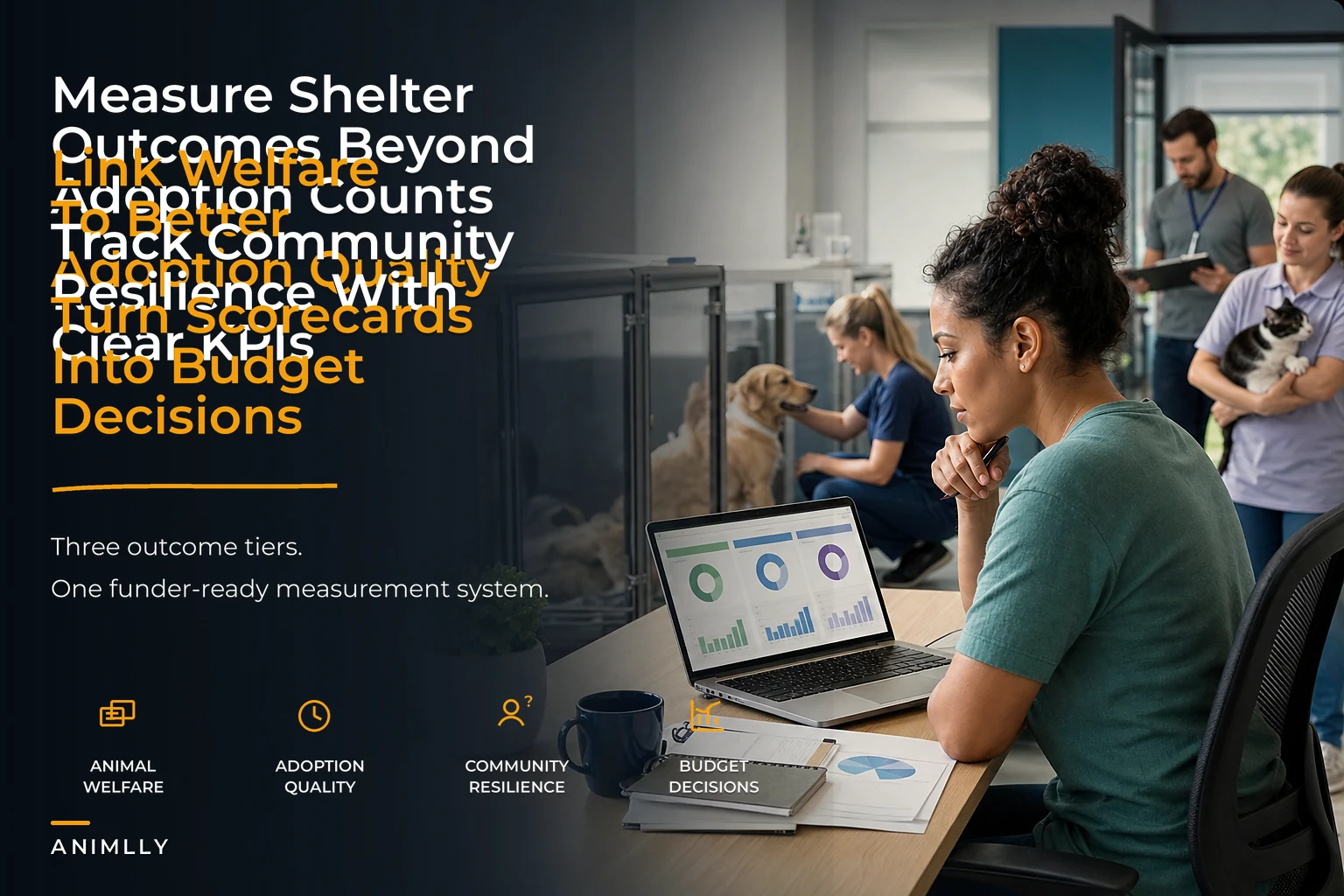
The framework has three tiers. Each answers a different question, and each needs a clear owner in your governance structure so the numbers actually drive decisions instead of sitting in a report nobody acts on.
Streamline your shelter operations effortlessly.
Animlly helps you manage every pet, volunteer, and adoption step with ease and accuracy.
- Comprehensive pet profiles
- Volunteer scheduling & communication
- Adoption tracking & reporting
No credit card required
-
Tier 1 — Animal welfare Were the animals in our care healthy, safe, and not deteriorating while with us?
-
Tier 2 — Rehoming / adoption quality Did animals leave to appropriate homes, and did those placements hold?
-
Tier 3 — Community resilience Are we reducing the upstream pressure that fills the shelter in the first place?
These are sequential dependencies, not parallel reports. Weak welfare data corrupts adoption quality — you can't match well if you don't know the animal. Weak adoption quality corrupts community resilience — returns are just re-intakes wearing a costume. If Tier 1 is a mess, the higher tiers are guesswork dressed up as strategy.
Tier 1 — Animal welfare KPIs
This tier is about the state of the animal while it's yours. Not just alive — well.
| KPI | Definition | Target range (starting point) | Watch signal |
|---|---|---|---|
| Medical clearance time | Days from intake to fully vetted/available | Under 4–5 days for healthy intakes | Rising = intake bottleneck or vet capacity gap |
| In-care illness rate | % of animals developing a new illness after intake | Under ~8% | Spikes point to zoning/sanitation gaps |
| Weight/body-condition maintenance | % of long-stay animals maintaining or improving BCS | 90%+ | Decline flags kennel stress or nutrition |
| Behavior deterioration rate | % of animals whose behavior score worsens after 14 days | Track your own baseline | Kennel stress, understimulation |
| Average LOS by segment | Median days in care, split by species/size/age | Segment-specific | The single best early-warning number you have |
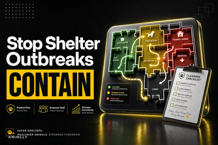
The in-care illness rate is the one most shelters under-measure. If you're seeing new respiratory or GI cases develop after intake, that's rarely a bad-luck problem — it's usually a housing and cleaning-cadence problem. This tier connects directly to your infection-control setup, and if that number is drifting, your first stop should be reviewing infection-control zoning maps and cohorting rules rather than blaming the season.
Track five to seven reliable Tier 1 metrics rather than a long noisy list; consistent recording beats quantity.
One honest note: don't over-instrument Tier 1. Five to seven metrics is plenty. The behavior deterioration rate especially requires consistent scoring across shifts, and if staff aren't recording behavior the same way, the number is noise. Better to track fewer things reliably than ten things sloppily.
Tier 2 — Rehoming and adoption quality KPIs
This is where most frameworks get lazy. They count adoptions. Counting adoptions tells you about volume, not quality. Adoption quality is measured after the animal leaves.
-
30-day return rate — the percentage of adoptions returned within 30 days. Fastest quality signal you have, and it's brutal but fair.
-
90-day retention rate — did the placement hold through the harder adjustment window?
-
Return reason distribution — behavioral, medical, housing, financial, "lifestyle." This is the diagnostic goldmine.
-
Match-to-return correlation — are certain animal segments or certain adoption pathways (events vs. in-shelter vs. foster-to-adopt) returning more?
-
Post-adoption support contact rate — what percentage of adopters you actually reached in the follow-up window.
The return reason distribution is what separates a shelter that improves from one that just reports. If 40% of your returns are behavioral, that's not an adoption-matching problem — it's a Tier 1 problem leaking downstream. The behavior work wasn't done or wasn't communicated. If most returns are financial or housing-related, that's a Tier 3 signal — community pressure that follow-up support might have caught.
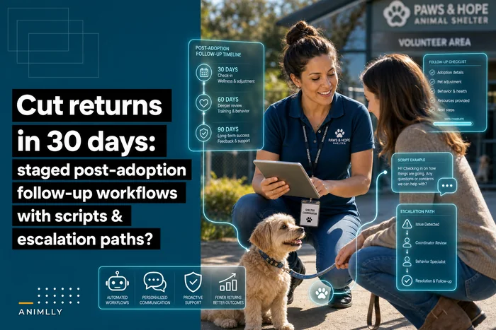
Returns are the hinge between the tiers, which is why the workflow behind them matters as much as the number itself. A staged follow-up process catches problems in the window where they're still fixable. If your return rate is your worst number, the fix usually isn't at adoption — it's in the days after, and this is where staged post-adoption follow-up workflows do more for the metric than any front-end screening change.
Worth naming: shelters that run heavy adoption events sometimes see event returns run 1.5–2x their baseline. That's not an argument against events — it's an argument for measuring by pathway so you know the real cost of the volume you're generating.
Tier 3 — Community resilience KPIs
This is the tier almost nobody measures, and it's the one funders increasingly want to see — because it's the difference between "we processed animals" and "we changed the local situation."
-
Surrender prevention rate — animals kept in home through diversion, per attempt.
-
Return-to-owner (RTO) rate — reunifications as a share of stray intake.
-
Repeat surrender rate — same household or same animal cycling back.
-
Community program reach — vaccinations, spay/neuter, food-bank touches per quarter relative to your service area.
-
Intake pressure trend — intake per capita over time, seasonally adjusted.
Tier 3 metrics move slowly, and that trips people up. A surrender prevention program won't change your quarterly intake in a way you can cleanly attribute. You have to measure it over 12–18 months and against a baseline, or you'll conclude it "isn't working" three months in and cut it right before it pays off.
Repeat surrender rate is the sleeper metric. A rising repeat rate means your diversion or adoption support is treating symptoms, not causes. It's the community-tier equivalent of the in-care illness rate — a quiet number that tells you the system is leaking somewhere upstream.
Dashboard wireframes: how the three tiers should actually look
A dashboard that lists thirty metrics is a dashboard nobody reads. The wireframe that works keeps each tier to a single glance and puts the action-triggering numbers up top.
Top strip — Action triggers (always visible): [ Kennel occupancy % ] [ 30-day return rate ] [ In-care illness rate ] ↑ triggers foster/ ↑ triggers matching ↑ triggers zoning capacity action review review
Tier 1 panel — Welfare (left column): Med clearance time (line, 8-week trend) In-care illness rate (bar, by zone) Avg LOS by segment (small multiples: dog/cat, adult/senior)
Tier 2 panel — Adoption quality (center): 30 / 90-day retention (paired bars) Return reasons (stacked bar — this is the one people stare at) Returns by pathway (event / walk-in / foster-to-adopt)
Tier 3 panel — Community (right column, slower cadence): Surrender prevention (rolling 6-month) RTO rate (trend) Repeat surrender rate (trend, flagged if rising) Intake pressure vs. same period last year
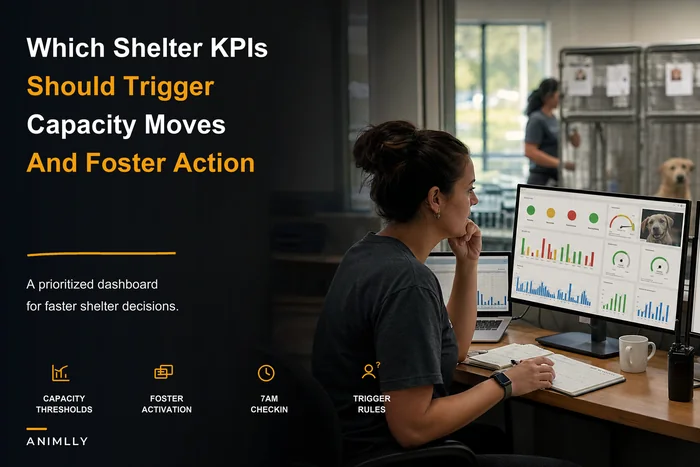
The design principle: the top strip is for this week's decisions, the tier panels are for this month's patterns, and Tier 3 is for this year's strategy. When everything is presented at the same visual weight, everything gets treated as urgent — which means nothing does. The occupancy and return thresholds up top are your operational trip-wires, the same logic behind a prioritized KPI dashboard where specific metrics trigger capacity and foster actions rather than just informing.
Here’s a simple visual to keep the dashboard workflow clear.
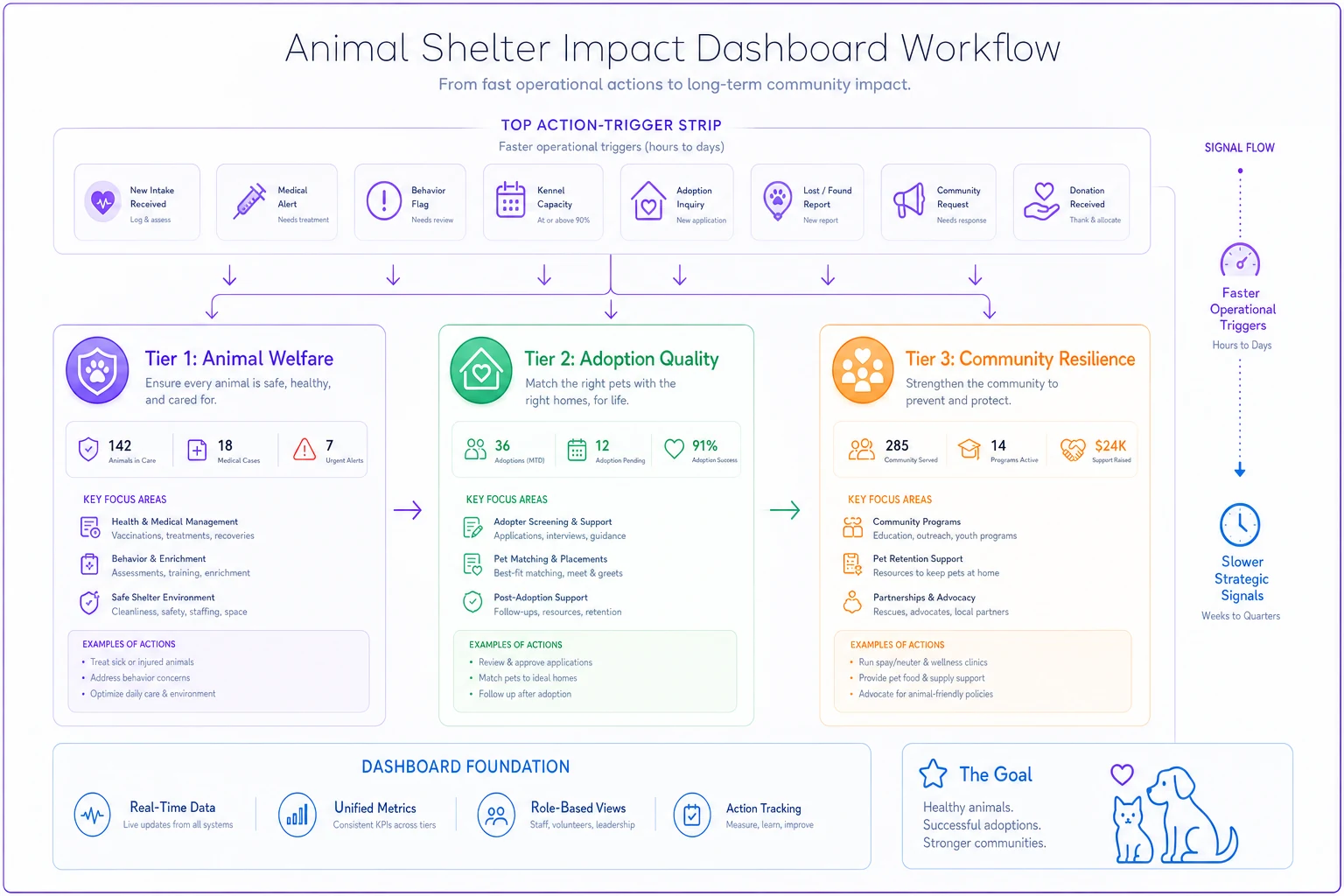
The top strip is for this week's decisions; the panels show monthly patterns and yearly trends so leaders don't overreact to slow-moving metrics.
Reporting cadence — matching the metric to the meeting
Different tiers move at different speeds, so reporting them all monthly is a mistake in both directions: welfare metrics need faster eyes, community metrics need slower ones.
| Cadence | What gets reviewed | Who reviews it |
|---|---|---|
| Daily / shift | Occupancy, new illness cases, urgent medical | Shift lead, medical lead |
| Weekly | LOS by segment, return rate, foster pipeline | Ops manager |
| Monthly | Full Tier 1 + Tier 2, return reason breakdown | Leadership team |
| Quarterly | Tier 3 trends, program reach, cost-per-outcome | Board + program leads |
| Annual | All tiers vs. baseline, funder reporting | Board + Executive Director |
The mistake to avoid: pulling Tier 3 numbers monthly and reacting to noise. A repeat surrender rate that ticks up one month means nothing on its own. The quarterly cadence exists precisely to stop leadership from over-steering on slow-moving numbers.
Funder-facing snippets
Funders don't want your raw dashboard. They want the story your tiers tell, tied to what their money actually did. Keep these short and concrete:
> Welfare: "In-care illness rate held at 6.8% across the year despite a 14% intake increase, reflecting the isolation-ward funding provided in Q1."
> Adoption quality: "90-day retention improved from roughly 87% to 91% after we added structured post-adoption follow-up, meaning fewer animals cycling back into care."
> Community: "Diversion and pet-food support kept an estimated 140–160 animals in their existing homes this year, reducing the intake we'd otherwise have absorbed."
These don't lead with the metric — they lead with the outcome the funder cares about and use the metric as evidence. And the community numbers are ranges. Being honest that Tier 3 is an estimate builds more credibility with a serious funder than a suspiciously precise figure.
Example scorecard: mapping outcomes to budget and governance
This is where the framework earns its keep — when a number changing actually changes what you fund and who's accountable.
| Outcome signal | Tier | Owner (governance) | Budget decision it drives |
|---|---|---|---|
| In-care illness > 8% | Welfare | Medical lead | Fund isolation capacity / cleaning hours |
| LOS rising for large dogs | Welfare | Ops manager | Fund enrichment / behavior support |
| 30-day returns > baseline | Adoption | Adoption coordinator | Fund follow-up program / matching training |
| Behavioral returns dominant | Cross-tier | Ops + Medical | Reallocate to behavior work pre-adoption |
| Repeat surrender rising | Community | Program lead | Expand diversion / support services |
| Surrender prevention flat | Community | Board committee | Review or restructure program |
The governance principle underneath this: every metric needs a single owner, and every owner needs a budget lever. A metric with no owner gets ignored. An owner with no budget authority gets frustrated. If your repeat surrender rate is climbing but nobody on your org chart can actually redirect funds toward diversion, the framework is just decoration.
A short real scenario
A mid-size municipal-contract shelter — roughly 2,400 intakes a year, small paid team, heavy on volunteers — was reporting a live-release rate in the low 90s and treating it as their headline success metric. Board was happy. Then their foster network started thinning and returns crept up to somewhere around 18–19% in the 30-day window.
When they broke returns down by reason, more than a third were behavioral. That pointed straight back to Tier 1: animals with LOS over three weeks were deteriorating behaviorally, getting adopted on enthusiasm, and coming back. The single live-release number had hidden the whole chain.
They didn't add staff. They restructured what they measured and who owned it — LOS-by-segment reviewed weekly by the ops manager, behavioral scoring standardized across shifts, and follow-up contact assigned to the adoption coordinator with a small budget for the first vet check. Over the following two quarters, 30-day returns came down to around 12–13%, and the behavioral share of those returns dropped noticeably. Live-release barely moved — but the animals leaving were staying gone, which is the outcome that number was supposed to represent all along.
The specific numbers aren't the point. The improvement was invisible until the framework connected welfare → adoption quality → the returns quietly refilling their kennels.
When this level of measurement makes sense — and when it doesn't
When it makes sense: You're past pure survival mode, you have at least basic digital records, and you're making real budget or staffing tradeoffs. Once you're deciding between funding a behavior program versus a diversion program, you need the tiers to see which one your data actually justifies.
When it's a bad idea: If your intake data itself is unreliable, don't build a three-tier framework on top of it — you'll be automating garbage into confident-looking reports. Fix data capture first. A tiny rescue moving a few dozen animals a year also doesn't need this; a clean spreadsheet and a monthly conversation is more honest and less overhead.
Who should not do this: Anyone tempted to roll it all out at once. Stand up Tier 1 first, get it trustworthy for a full quarter, then add Tier 2, then Tier 3. Every shelter that tries to launch all three tiers simultaneously ends up with three half-measured tiers and no one who trusts the dashboard.
The system view
The reason to bother with all of this is coordination. A shelter is a pipeline where welfare feeds matching, matching feeds retention, and retention feeds — or fails to feed — community pressure. When you measure those as three separate reports for three separate audiences, you optimize each in isolation and the seams tear. Returns quietly climb. Foster networks quietly exhaust. Programs get cut right before they'd have paid off.
A real shelter outcome measurement framework isn't more metrics. It's fewer, connected metrics, each with an owner and a budget lever, reported at the speed the metric actually moves. Get that right and your board stops seeing a wall of green and starts seeing the tradeoffs they're actually there to decide.
A real shelter outcome measurement framework isn't more metrics. It's fewer, connected metrics, each with an owner and a budget lever, reported at the speed the metric actually moves. Get that right and your board stops seeing a wall of green and starts seeing the tradeoffs they're actually there to decide.
Ready to enhance your shelter’s impact?
Join 500+ shelters using Animlly to improve care coordination, increase adoptions, and engage communities effectively.